

Streamlining Lead Generation by Redesigning Skrapp’s Chrome Extension
With an increasing 64.86% global market share in the browser market, Google Chrome extension market has declined in sheer volume over the past three years, largely due to different Google policies going on.
Regardless of the decline, there has also been a steady demand for more productivity related extension tools with AI capabilities and Skrapp safely positions its self with currently over 200K users using the extension. The AI extension market is valued at over $1.5b in 2023 and all these show that there are potentials to increase revenue generation by optimising and improving the Skrapp extension. I saw this as a quick win and was excited to start working on it.
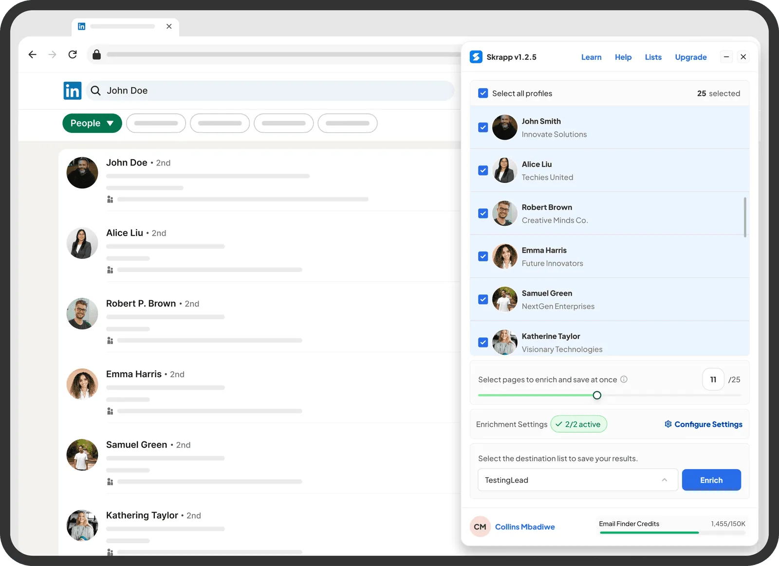
user satisfaction score compared to the older extension version.
reduction in average time to configure and launch lead profile search
less front-end queries due to easy developer hand off and documentation
The Challenge
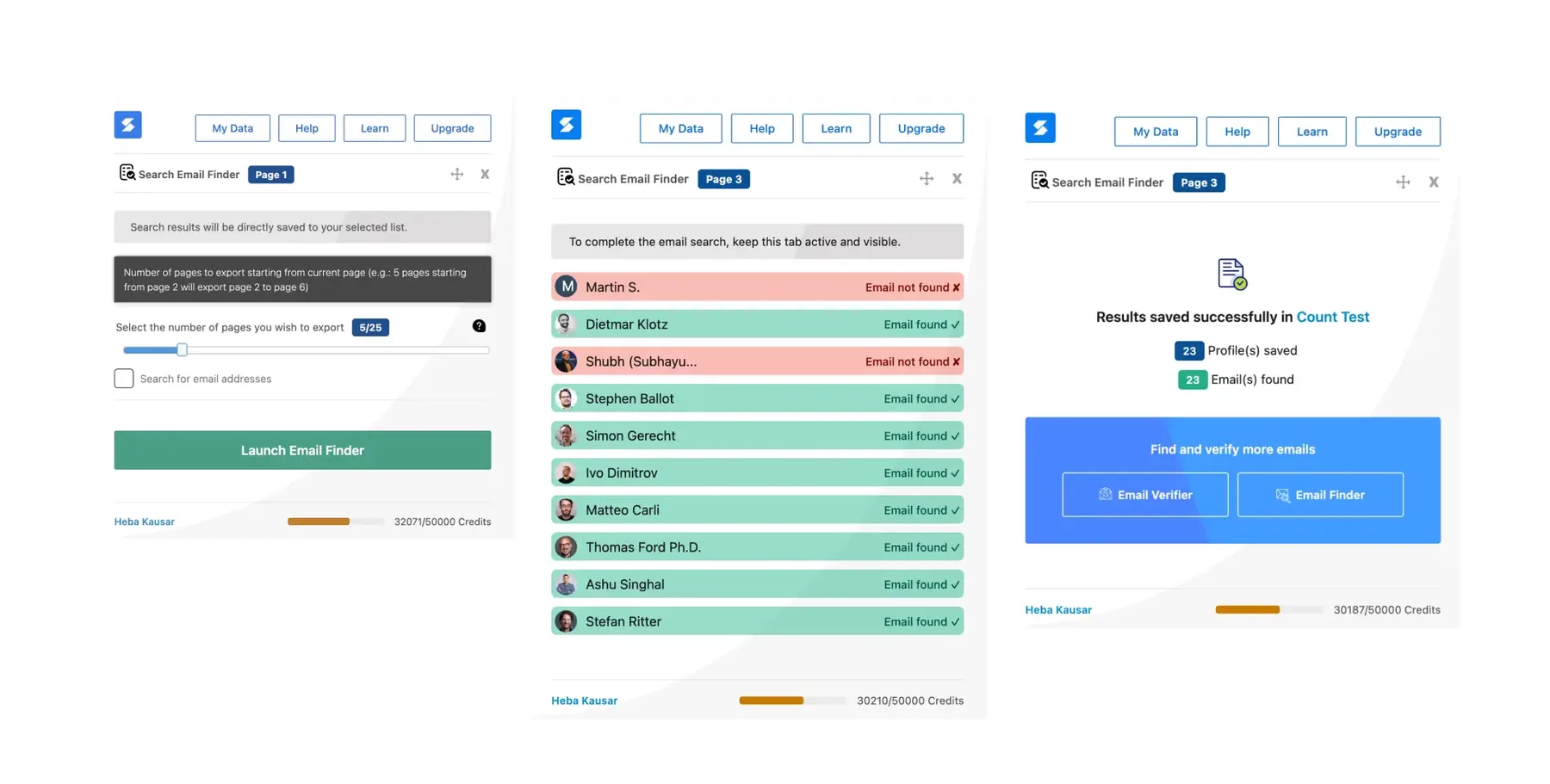
Skrapp.io’s Google Chrome Extension used by a lot of our users for LinkedIn scraping had never been properly designed and had several usability and design issues. It was a simple 3 step flow that required users to Launch Extension → Configure any preference → Enrich list. This 3 step flow interface was cluttered and visually outdated, the styling did not match our design system, there were disjointed user experience from Chrome Extension to the web app and the changes we had made so far within the product needed to reflect within the extension. There were also issues with conflicting hierarchy in buttons and information architecture because they did not align with Skrapp.io’s evolving brand and UI design
My Role
As the Product Designer, I led the end-to-end design process which included competitor research & analysis, reviewing user tickets and internal feedback and understanding pain points. I collaborated closely with the Product Manager to define goals and with Developers to ensure feasibility and smooth handoff.
Our Goal
Redesign the Google Chrome Extension by simplifying the workflow for lead finding and saving. Improve visual clarity with better hierarchy and spacing. Ensure there is a consistency with the user journey from extension use to product use. Increase efficiency for daily users, minimising clicks and reducing visual noise
Process - Lean UX
Competitor Research & Discovery
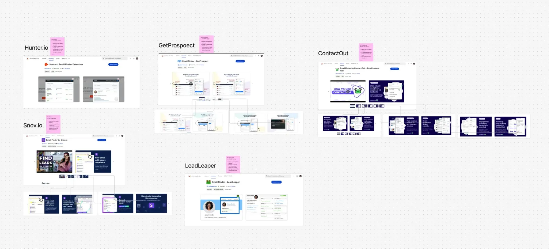
Without having access to direct user interviews, due to a very tight deadline and limited tracking available. I started with an initial analysis of the extension to better understand the pain points. I ran a competitor comparison to evaluate Chrome extensions that had a 5 star rating such as Hunter.io, Apollo and Lusha to better understand best practices in layout, flows and trigger point.
After that I conducted an internal observation by interviewing sales and marketing team mates who use the extension for outreach. I mapped different friction points on the old version and started to note down different issues. for this project per sprint.
Top Insights were:
- Users wanted a clearer overview of leads that were been selected.
- Information overload in the main pop-up led to slower decision-making.
- Visual inconsistency made it hard to trust the extension’s reliability.
😕 Visually Outdated UI
"The existing UI was outdated and had inconsistent styling for core actions and components."
😭 No Access to User Testing Logs
"There were no access to user testing or real behavioural data beyond support tickets."
😳Disjointed User Journey from Extension to App
"Each feature had different UI patterns, leading to inconsistent development and user confusion."
😤 Brand Mismatch
"The extension did not match the revamped Skrapp's product and brand positioning."
Exploration - Journey Mapping
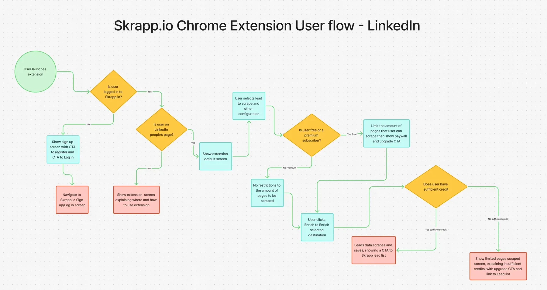
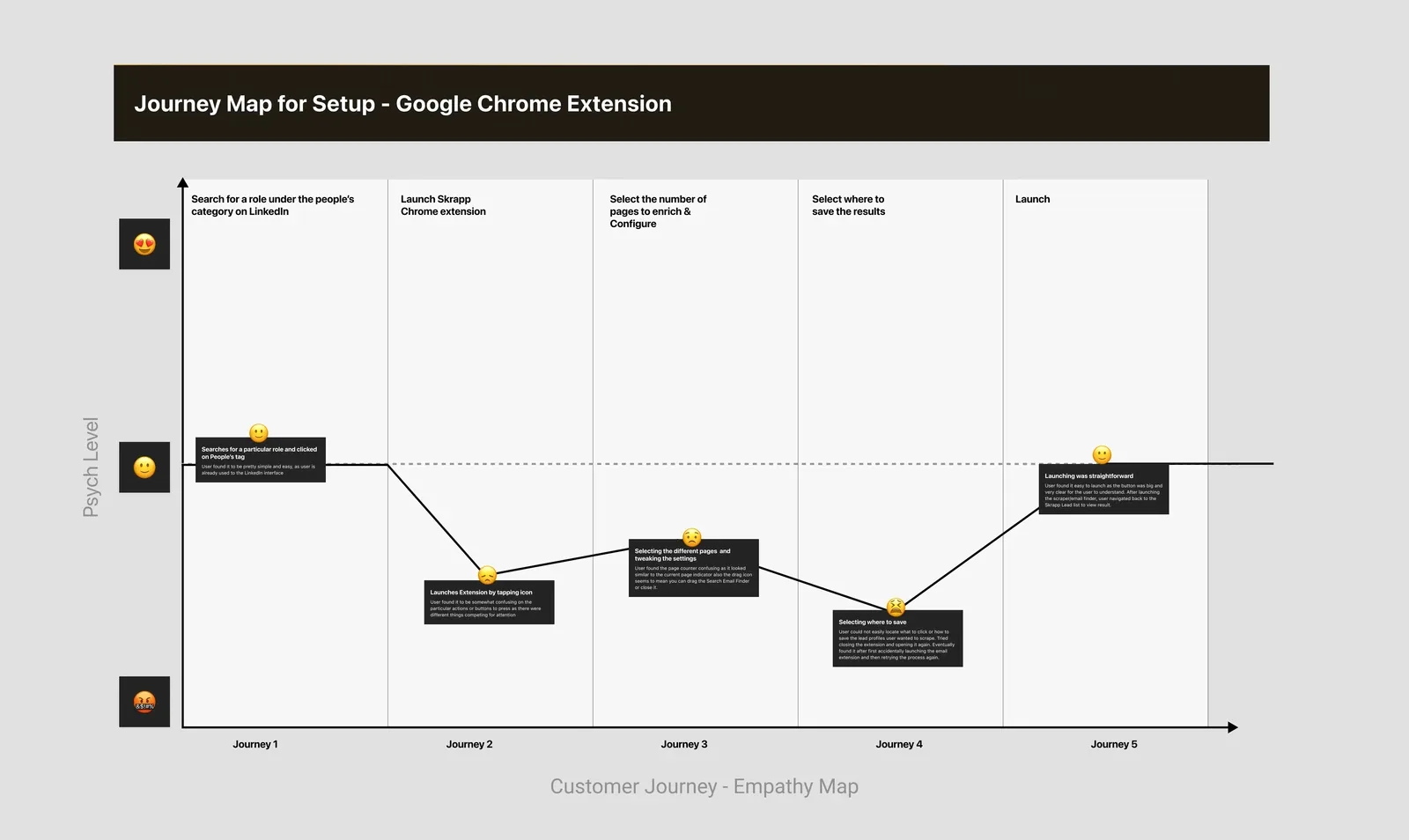
I mapped the extension’s journey from Activation → Lead Capture → Export → Verification. As the extension use was mainly centred around lead capture and export, I further mapped the user flow which was from Launch Extension → Configure any preference → Enrich list. This visualisation helped prioritise what mattered most in the redesign — minimising friction, surfacing progress feedback and reducing noise.
Without having access to direct user interviews, due to a very tight deadline and limited tracking available. I started with an in-depth analysis of the core user journey map to understand how the 3 simple steps could be improved, I used a psych evaluation method to see the pain points that had been mentioned on different support tickets. This helped me ideate on how best to create wireframes for the redesign.
Low-Fidelity Wireframes
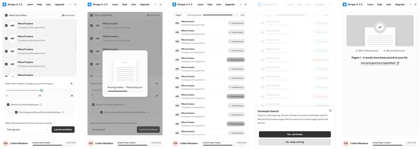
I began with quick mid-fidelity wireframes to explore hierarchy, CTA placement, and microcopy. I have a knack for ensuring my wireframe designs look functional and a bit close to the real experience, in a bid remove a high degree of abstraction. This helped me visually align with stakeholders on the design direction I had for the project.
By creating only the core extension wireframes, I was able to quickly validate and test with stakeholders and our internal team members. Feedback was given on certain minor elements to adjust and copy standards to follow, which I implemented for the next round of review session.
Testing & Validation
Without external testing available and with the growing urgency to deploy, I organised 3 rounds of internal testing and review session with team members and stakeholders:
- Observed task completion (e.g., find and save a cohort of leads, select specific leads to export)
- Gathered qualitative feedback (“What confused you?”, “Where did you expect this button?”)
- Screen size dependencies (“Using on different desktop viewport”)
This method proved crucial in catching micro-interaction issues early and aligning with developer constraints and I was able to make key changes based on the feedback.
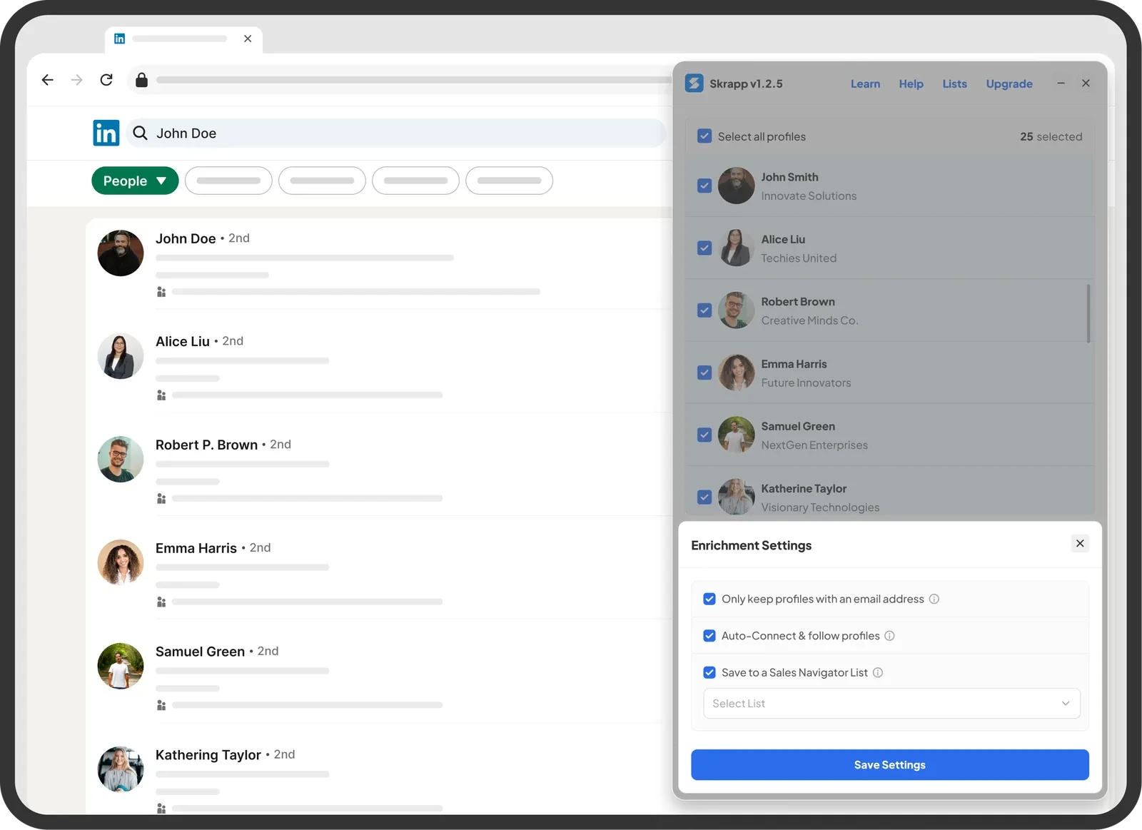
- Changes to configuration section - The vertical height of the profile component section was too short, hence the need to break the configuration settings screen to a half sheet component
- Simplify copy standards - Simplified error messaging (“Email not found” → “No email found for this profile”)
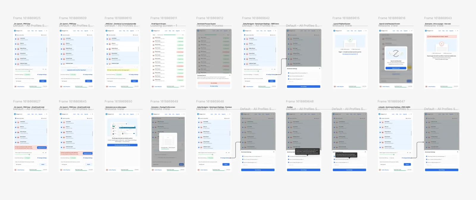
- Address edge cases - Redesign component sections for different edge cases (Free users, Premium users, Premium users who run out of credit mid launch, LinkedIn pages or pages with errors and system errors)
user satisfaction score compared to the older extension version
reduction in average time to configure and launch lead profile search
Design Solution
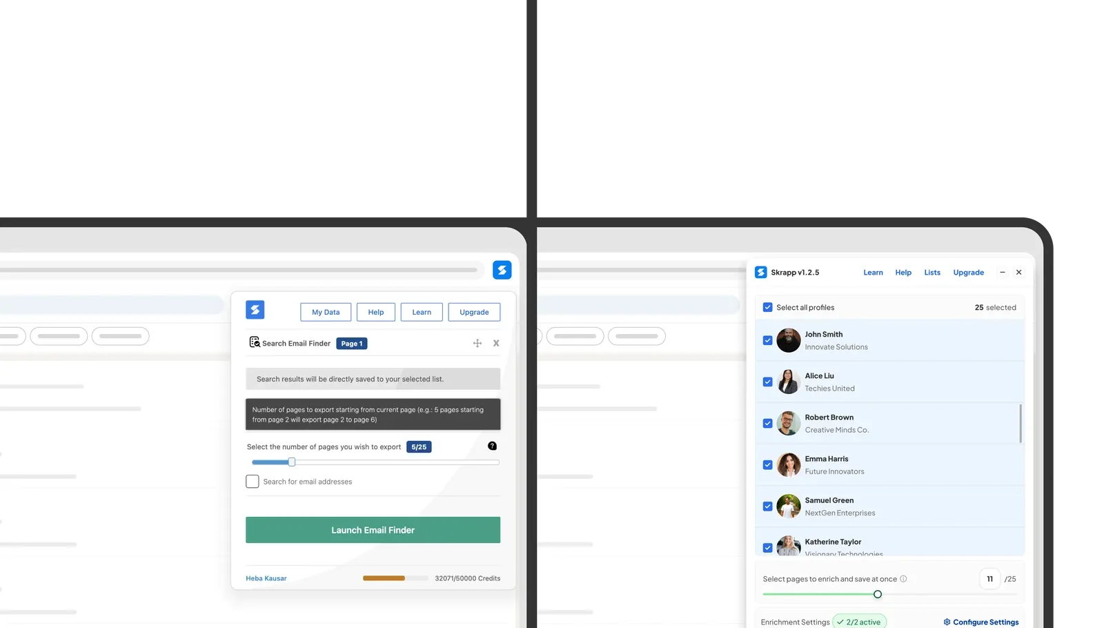
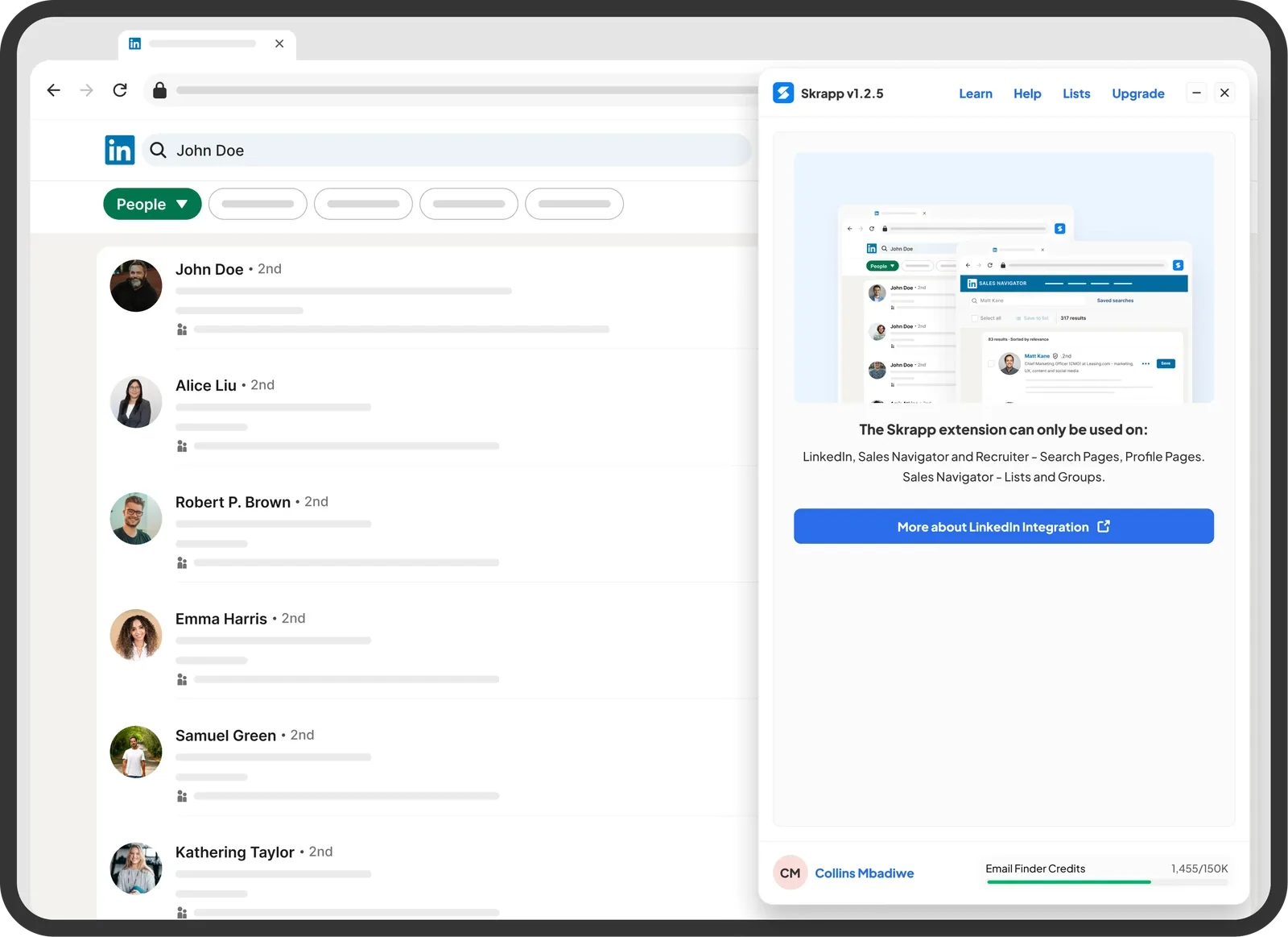
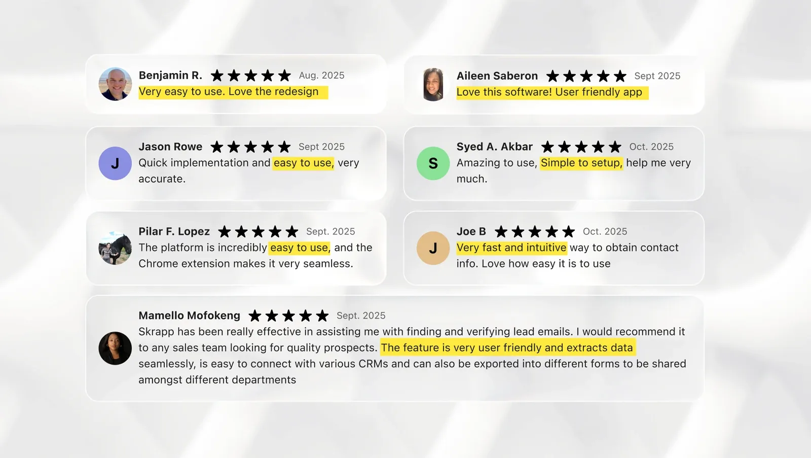
The final solution involved reorganising the “Configuration settings” section to a half sheet component, creating edge cases for different users, adding tooltip, visual assets to communicate error states, credit usage, system failures and more. The redesign proved to be absolutely worth it as our review section on Google Chrome extension skyrocketed from 4.5 rating to 4.7 rating.
Some key final outcome to highlight:
- Streamlined user journey: 3-step journey
- Consistent design language with new Skrapp.io platform
- Improved visual hierarchy and action clarity
- Optimised code handoff through component documentation
Outcome and Business Impact
After the launch of the redesign we monitored support tickets and internal comms as we were still working on adding more tracking capabilities to the extension. We had a 25% faster time to first save increase due to internal testing. My PM called it “The cleanest and most intuitive version of Skrapp Extension yet.” Also we had 20% less front-end queries thanks to the smooth Figma component documentation.
Faster time to first save on lead profiles
Less front-end queries due to easy hand off
Learnings and Reflections
Working on this project made me realise that sometimes, speed doesn’t kill design quality, especially when paired with structured collaboration. Also even though we lacked enough hard core external user testing, internal feedback loops proved to be super effective as it can uncover a significantly high amount of usability issues.
Finally, a Lean UX process can be ideal for fast-paced redesigns, limited resources and time constraints, provided you keep tight alignment between design, PM, and development as well as ensuring there is smooth and open communication.
Next Steps
We plan on releasing a v2.1 once we have more than enough data to support feature enhancement and ai improvements. Also considering usability studies to gather user feedback post-launch. There is an ongoing process of adding analytics tracking (clicks, completion rates) for continuous UX measurement. Lastly, we are in the process of extending the new UI system across browser integrations especially Mozilla firefox and Edge browser